When accessibility + informativity + many details = absurdly long alt-texts
And when "clear and concise" and "informative" are more than just mutually exclusive in alt-text
Artikel ansehen
Zusammenfassung ansehen
Alt-text isn't an invention of social media, even less an invention of the Mastodon community. Text that describes images especially to blind or visually-impaired users while "embedded" in the pictures themselves has been around for quite a while. Until recently, however, it was mostly a question of good Web design.
When Mastodon exploded, so did the use of alt-text on social platforms. Granted, on Twitter, hardly anyone uses alt-text. But starting on Mastodon, it became good manners to ad alt-text to all pictures and media you post anywhere in the Fediverse, no matter where you are. If you don't, you're likely to be criticised, and many users openly point out that they refuse to boost or reshare anything that contains even only one picture without alt-text.
But alt-text itself has changed along with this trend.
Web design bibles recommend alt-text to be clear and concise; one sentence is enough. The Fediverse has rendered this obsolete. The Fediverse loves and seems to pretty much demand alt-text to be informative and detailed. If it's visible somewhere in the picture, it has to be described. And if it isn't clear what exactly it is that's shown, neither from the message body nor from the alt-text nor from common knowledge, it has to be explained.
In fact, the scope of alt-text in the Fediverse has been expanded from describing to blind or visually-impaired users what sighted users can see to also describing what even eagle-eyed users couldn't possibly see, whatever that may be.
I've seen pictures on Mastodon with alt-text that's longer than a toot could possibly be. Mind you, Mastodon has a hard limit of 1,500 characters for alt-text. But what I've never seen is users being criticised for their alt-texts being too long.
Here are a few examples.
 Mar :purplecheck: wrote the following Beitrag Tue, 04 Jul 2023 17:31:12 +0200
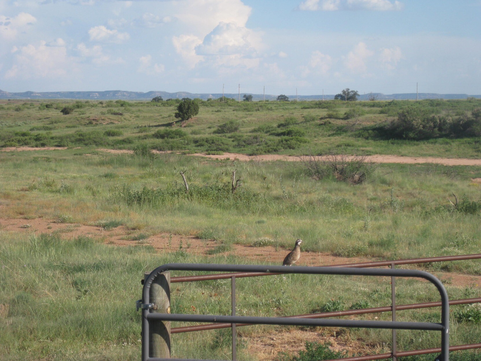
This is a nature shot. Nothing much can be seen here. Still, it's four and a half lines of alt-text.
 RamenCatholic 🐢 🌈 wrote the following Beitrag Tue, 04 Jul 2023 20:59:16 +0200
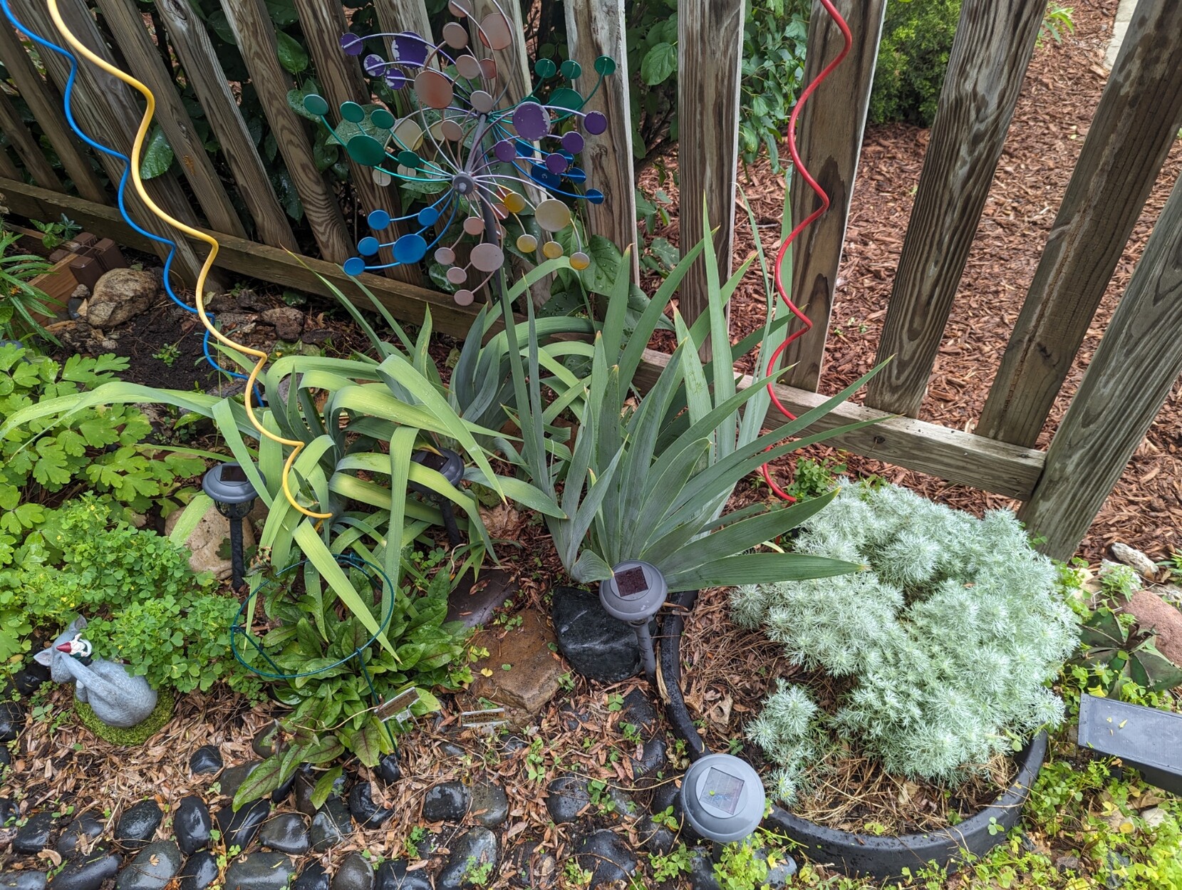
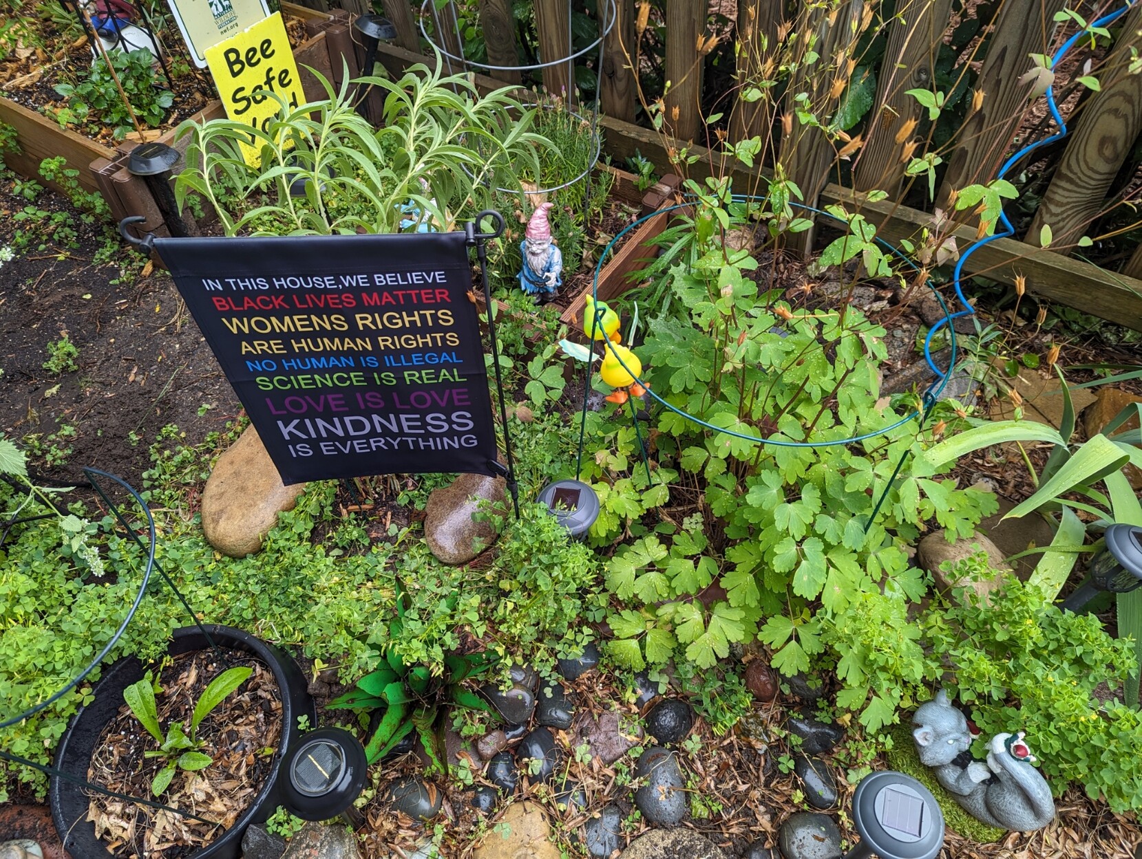
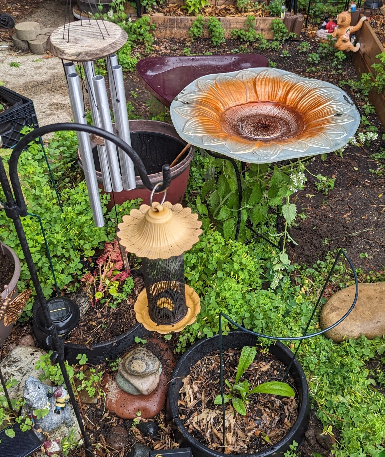
For your #BloomScrolling pleasure, I present one of my small #RainGardens
Bonus #GnomeWar locations in #AltText
#GardenForWildlife #GardeningForWildlife #GardeningForPollinators #GardeningForBees #BeeSafeYard #GardensOfMastodon #RainGarden #GardenPhotography #Garden #Gardens #GardenGnomes
Three gardening pictures that really go into detail. One of them, however, breaks the golden rule that any and all text in pictures must be transcribed verbatim.
 Victor “🧵” Wynne wrote the following Beitrag Sat, 08 Jul 2023 02:46:37 +0200
This is what happens when you try to write a detailed and informative alt-text for a picture taken in Manhattan. Seven and a half lines of alt-text. And it could still be improved by providing more transcriptions.
So yes, it happens.
I myself am none of those who boycott things just because they can't be bothered. If the Fediverse demands alt-text, it shall have alt-text. If the Fediverse demands detailed alt-text, well, then so be it, no matter how, as long as it's technologically possible. And it is. You wouldn't believe how it is.
Now, I'm not on Mastodon and a mobile app. I'm here on Hubzilla through a run-of-the-mill desktop Web browser and on a desktop PC with a hardware keyboard in front of me. So "hard to type on a touch screen" isn't valid for me either, and I'm free from Mastodon's limitations.
On the one hand, over here on Hubzilla, alt-text is part of the message body, and the length of alt-text is not separate from the length of a post. On the other hand, post length is next to unlimited here. I could write posts with tens of thousands of characters. I can cram more characters into one post than most Mastodon users toot in one month.
There isn't any alt-text limit either because Hubzilla doesn't have a dedicated alt-text system like Mastodon; instead, alt-text is manually grafted into the BBcode that inserts pictures into posts. So I could also write alt-texts with tens of thousands of characters, easily enough to transcribe scanned newspaper articles or screenshots of blog posts in their entirety. Mastodon will truncate them at 1,500 characters, but I can still write them.
None of this is limited to articles like these. What I can do in articles, I can do all the same in posts, only that Mastodon users won't be able to see it properly then. That's why I've chosen to make this an article, seeing as the vast majority of Fediverse users are Mastodon users for whom many of the features of this article as a post wouldn't work. This being an article makes them read it in a Web browser outside their timelines, a place where image embedding and text formatting works properly.
Still, I have a problem. And that problem comes from what kind of content I post here. If you're lucky, it's a meme which is easy to describe.
If not, I post pictures from inside virtual worlds based on OpenSimulator. And that's something that not even two dozen Fediverse users are familiar with. Out of an eight-digit number altogether. Everyone who isn't familiar with it, potentially over 13,000,000 people, requires explanations on all the things they don't know. And it's highly likely that they don't know anything in these pictures.
I've written a very lengthy post about this a few months ago. I didn't get much feedback back then. What feedback I got was that I should keep my alt-texts short. But what I see around the Fediverse suggests otherwise.
Allow me to share with you a post that confirms that I'm not the only one who thinks like this.
"This is especially true for technical topic photos. By accurately describing what's in the picture, you give context to non-technical viewers, or newbies, as to exactly what they're looking at, and even describe how it works or why it matters." And this, dear @Stormgren, is absolutely essential for the pictures I post. But it's likely to be a whole lot.
Now you might say that detailed descriptions and explanations for pictures should go into the post itself. This is only true if the post is about the picture.
But this isn't Pixelfed. I rarely write about pictures. I use pictures to illustrate what I'm writing about. Including in-world pictures with sometimes lots and lots of details which even the millions of sighted Fediverse users wouldn't recognise, not to mention blind or visually-impaired users. Now, this isn't art photography. I don't arrange the stuff in the pictures that way. I can't help it if they end up with so much in them to see.
Okay, now let me give you an example. The picture itself doesn't have an alt-text, for I'm going to discuss possible alt-texts below. In the process of doing so, I'm going to describe this picture in all its details. So don't worry, you probably won't miss out on anything.
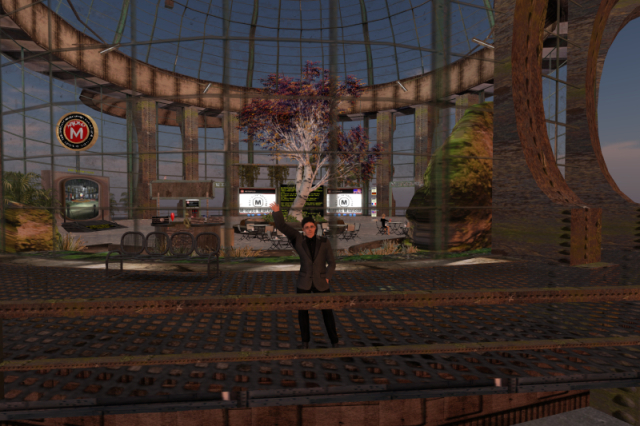
Again, this isn't Pixelfed. The context in which I'd post the picture would not be, "Look at this picture!" It'd be a post about the Metropolis grid in OpenSim shutting down soon after a whopping 14 years of operation. The picture would only illustrate it, showing my old Metropolis avatar waving good-bye before vanishing along with the grid. In this context, it'd simply be completely out of place to write a 200-character post about the Metro shutdown, add the picture and then add an image description that's thousands upon thousands of characters long.
In the thread I've linked further above, I got a few alt-text suggestions which a) imply that the picture is part of an Instagram-style post about the picture, thus justifying a full description outside the picture, and b) it's clear to the on-looker what's going on. Neither applies to this picture.
Eventually, I suggested this:
It was considered okay.
But it's faulty.
Again, it implies that there's a description somewhere else in the post which implies that it's a post about this picture instead of a post merely illustrated by this picture.
So the alt-text roughly mentions what's going on in the picture. But it doesn't say a word about what's actually in the picture.
And what's in this picture is a lot.
If I were to deliver a full description at a level of detail similar to what I've re-shared above, this could be it:
7,636 characters. More than could fit into 15 toots or five Mastodon alt-texts. Yes, that's monstrous. Yes, I've written that myself. No, ChatGPT couldn't do that. It would have to investigate in-world.
But it still isn't sufficient. No, really, it isn't.
For one: What's this Metropolis Metaversum? If I were to explain that to you, what's OpenSimulator?
See, the difference between at least halfway well-known real-life locations and locations in virtual worlds is that the former can be assumed to be known. If not, a few words are sufficient, namely until you reach the name of the nation where something is. Or maybe, maybe the continent. But even in Second Life, you can't assume that anyone knows what and where it is, even less in OpenSim about which even hardly any Second Life users seem to know anything.
Normally, the picture would be used as an illustration in a post about the closure of Metropolis, so I wouldn't have to explain that in the alt-text. In fact, that's what I've uploaded the picture for. In the context of this article, however, this isn't mentioned anywhere, so it requires explanation which I have to add. In fact, some more explanation may be necessary in addition.
And besides, there's still untranscribed text in the picture. Especially the content of the black sign behind the ash tree would be interesting. Granted, I don't know if it's mandatory to transcribe writing that's a) so tiny that I can't even read it in my picture at its original resolution of 2100x1400 and b) partly obscured by a tree trunk and the structure of the building. I must admit that I would gladly have provided a full transcript of the whole sign including all parts covered by other objects. I actually went in-world to where this building is preserved almost in its final state to write the transcriptions in both versions. But this sign has been removed, uncovering the outside shot of this very building which the sign conceals in this picture.
So let's add what's missing and mark it red.
Now I'm at 10,985 characters. Almost the size of 22 toots and more than seven times as long as a Mastodon alt-text could possibly be. For an alt-text. And there's still something missing which I can't add because all sources for it are gone. And the description of what's on the screen of the walk-in teleporter could include some more details, especially since it's hard to recognise even for sighted people with huge computer screens in front of them unless they go and visit the preserved copy of this building in-world and then zoom in on the screen. But except for that, I'd say it's complete enough to satisfy even those who are the most critical about alt-text.
By the way, should I ever use it as an actual alt-text for a picture, I won't add the colour tags. They're purely demonstrational to show the differences between the two versions.
Unfortunately, while this ought to be helpful for blind or visually-impaired Fediverse users, it comes with one big disadvantage. Screen readers can't navigate alt-text like they can navigate normal, on-screen text. All they can do is rattle it down in one go. You can't stop it, you can't go back to anywhere in it. You have to sit through the five minutes or more which a screen reader may take to read this out loud. And even sighted users may struggle reading this if whatever they use to access the Fediverse has an automatic time-out for showing alt-text, and the alt-text of this picture vanishes long before they're done reading it.
Also, I must admit that writing such long alt-texts is inconvenient for myself as well. It took me several hours to write all this, including transcribing text that's only one pixel high in the final picture even when you zoom in, if it's visible at all.
And lastly, I couldn't use this as an alt-text to improve accessibility anyway. Mastodon automatically truncates alt-text at 1,500 characters which would reduce the above text to this:
Not very informative, and all transcriptions are missing.
There's even a request to reduce this maximum length further, namely to the 450 characters Mastodon had in the beginning:
Happy now? I think not.
Fortunately, as of now, Fediverse users, Mastodon users in particular who aren't used to enormously long texts in the Fediverse, are already satisfied with any alt-text that isn't just two or three words. Most of the time, it's only, "No alt-text, no boost!"
But when the Fediverse mainstream switches to "Alt-text not informative enough, no boost!" or ostracising people who write lacking alt-texts which are still considered perfectly okay by some nowadays, and I have to write an alt-text for a similarly detailed picture that's used as an illustration, then I'll run into a big problem.
When Mastodon exploded, so did the use of alt-text on social platforms. Granted, on Twitter, hardly anyone uses alt-text. But starting on Mastodon, it became good manners to ad alt-text to all pictures and media you post anywhere in the Fediverse, no matter where you are. If you don't, you're likely to be criticised, and many users openly point out that they refuse to boost or reshare anything that contains even only one picture without alt-text.
But alt-text itself has changed along with this trend.
Web design bibles recommend alt-text to be clear and concise; one sentence is enough. The Fediverse has rendered this obsolete. The Fediverse loves and seems to pretty much demand alt-text to be informative and detailed. If it's visible somewhere in the picture, it has to be described. And if it isn't clear what exactly it is that's shown, neither from the message body nor from the alt-text nor from common knowledge, it has to be explained.
In fact, the scope of alt-text in the Fediverse has been expanded from describing to blind or visually-impaired users what sighted users can see to also describing what even eagle-eyed users couldn't possibly see, whatever that may be.
I've seen pictures on Mastodon with alt-text that's longer than a toot could possibly be. Mind you, Mastodon has a hard limit of 1,500 characters for alt-text. But what I've never seen is users being criticised for their alt-texts being too long.
Examples from the Fediverse
Here are a few examples.
This is a nature shot. Nothing much can be seen here. Still, it's four and a half lines of alt-text.


For your #BloomScrolling pleasure, I present one of my small #RainGardens
Bonus #GnomeWar locations in #AltText
#GardenForWildlife #GardeningForWildlife #GardeningForPollinators #GardeningForBees #BeeSafeYard #GardensOfMastodon #RainGarden #GardenPhotography #Garden #Gardens #GardenGnomes
Three gardening pictures that really go into detail. One of them, however, breaks the golden rule that any and all text in pictures must be transcribed verbatim.
This is what happens when you try to write a detailed and informative alt-text for a picture taken in Manhattan. Seven and a half lines of alt-text. And it could still be improved by providing more transcriptions.
So yes, it happens.
My situation
I myself am none of those who boycott things just because they can't be bothered. If the Fediverse demands alt-text, it shall have alt-text. If the Fediverse demands detailed alt-text, well, then so be it, no matter how, as long as it's technologically possible. And it is. You wouldn't believe how it is.
Now, I'm not on Mastodon and a mobile app. I'm here on Hubzilla through a run-of-the-mill desktop Web browser and on a desktop PC with a hardware keyboard in front of me. So "hard to type on a touch screen" isn't valid for me either, and I'm free from Mastodon's limitations.
On the one hand, over here on Hubzilla, alt-text is part of the message body, and the length of alt-text is not separate from the length of a post. On the other hand, post length is next to unlimited here. I could write posts with tens of thousands of characters. I can cram more characters into one post than most Mastodon users toot in one month.
There isn't any alt-text limit either because Hubzilla doesn't have a dedicated alt-text system like Mastodon; instead, alt-text is manually grafted into the BBcode that inserts pictures into posts. So I could also write alt-texts with tens of thousands of characters, easily enough to transcribe scanned newspaper articles or screenshots of blog posts in their entirety. Mastodon will truncate them at 1,500 characters, but I can still write them.
None of this is limited to articles like these. What I can do in articles, I can do all the same in posts, only that Mastodon users won't be able to see it properly then. That's why I've chosen to make this an article, seeing as the vast majority of Fediverse users are Mastodon users for whom many of the features of this article as a post wouldn't work. This being an article makes them read it in a Web browser outside their timelines, a place where image embedding and text formatting works properly.
Still, I have a problem. And that problem comes from what kind of content I post here. If you're lucky, it's a meme which is easy to describe.
If not, I post pictures from inside virtual worlds based on OpenSimulator. And that's something that not even two dozen Fediverse users are familiar with. Out of an eight-digit number altogether. Everyone who isn't familiar with it, potentially over 13,000,000 people, requires explanations on all the things they don't know. And it's highly likely that they don't know anything in these pictures.
I've written a very lengthy post about this a few months ago. I didn't get much feedback back then. What feedback I got was that I should keep my alt-texts short. But what I see around the Fediverse suggests otherwise.
Allow me to share with you a post that confirms that I'm not the only one who thinks like this.
Alt-text doesn't just mean accessibility in terms of low -vision or no-vision end users.
Done right also means accessibility for people who might not know much about your image's subject matter either.
This is especially true for technical topic photos. By accurately describing what's in the picture, you give context to non-technical viewers, or newbies, as to exactly what they're looking at, and even describe how it works or why it matters.
#AltText is not just an alternate description to a visual medium, it's an enhancement for everyone if you do it right.
(So I can't find any prior post of mine on this, so if I've actually made this point before, well, you got to hear a version of it again.)
"This is especially true for technical topic photos. By accurately describing what's in the picture, you give context to non-technical viewers, or newbies, as to exactly what they're looking at, and even describe how it works or why it matters." And this, dear @Stormgren, is absolutely essential for the pictures I post. But it's likely to be a whole lot.
Now you might say that detailed descriptions and explanations for pictures should go into the post itself. This is only true if the post is about the picture.
But this isn't Pixelfed. I rarely write about pictures. I use pictures to illustrate what I'm writing about. Including in-world pictures with sometimes lots and lots of details which even the millions of sighted Fediverse users wouldn't recognise, not to mention blind or visually-impaired users. Now, this isn't art photography. I don't arrange the stuff in the pictures that way. I can't help it if they end up with so much in them to see.
Example picture from me
Okay, now let me give you an example. The picture itself doesn't have an alt-text, for I'm going to discuss possible alt-texts below. In the process of doing so, I'm going to describe this picture in all its details. So don't worry, you probably won't miss out on anything.

Again, this isn't Pixelfed. The context in which I'd post the picture would not be, "Look at this picture!" It'd be a post about the Metropolis grid in OpenSim shutting down soon after a whopping 14 years of operation. The picture would only illustrate it, showing my old Metropolis avatar waving good-bye before vanishing along with the grid. In this context, it'd simply be completely out of place to write a 200-character post about the Metro shutdown, add the picture and then add an image description that's thousands upon thousands of characters long.
In the thread I've linked further above, I got a few alt-text suggestions which a) imply that the picture is part of an Instagram-style post about the picture, thus justifying a full description outside the picture, and b) it's clear to the on-looker what's going on. Neither applies to this picture.
Eventually, I suggested this:
My Metropolis avatar, waving a last farewell from the Metropolis welcome building
It was considered okay.
But it's faulty.
Again, it implies that there's a description somewhere else in the post which implies that it's a post about this picture instead of a post merely illustrated by this picture.
So the alt-text roughly mentions what's going on in the picture. But it doesn't say a word about what's actually in the picture.
And what's in this picture is a lot.
If I were to deliver a full description at a level of detail similar to what I've re-shared above, this could be it:
My avatar in the Metropolis Metaversum, waving a last farewell from the Metropolis welcome building before Metropolis shuts down for good. The avatar is a light-skinned, dark-haired male adult wearing metal-framed glasses, a dark grey blazer jacket with darker grey shoulders and collar, a black button-down shirt buttoned up all the way to the collar, a pair of dark black denim jeans and a pair of black full-brogue shoes. He is standing on the outside platform of level 3, the top level of the building and waving his right hand while having his left hand on his hip. The floor of the platform is a rusty steel girder that's so coarse that it'd be fairly hard to walk on in real life. In front of him is the double railing made of likewise rusty steel that surrounds the platform. Below the platform, the rust-coated structure that carries level 3 can be seen. Level 3 itself, entirely behind the avatar with the exception of the outside platform, is encased in a glass cupola with a cylindrical lower part and a spherical upper part, both with semi-transparent green reinforcements between what would otherwise appear as single glass panes. The spherical upper part rests on a support ring made of sheet metal panels with rusty outer edges. This ring, in turn, is carried by four triple sets of boxy, rusty steel columns with semi-elliptical cutouts on the far side of the cupola that roughly give the impression of being riveted. One triple set of columns can be seen right outside the cupola to the right of the avatar, another two can be seen in the background to the left and to the right of the avatar. Within each triple set except the one in the front to the right, there are two passageways into the cupola. Each passageway is surrounded by a greenish metal frame; each pair of these frames carries the marquee "METROPOLIS GRID" made of light grey concrete with blinking white lightbulbs on it. A circular structure made of rusty steel pipes is mounted on the inside of the support ring and carries a number of neon lights with rusty sheet metal covers above them. A semi-circular structure made of likewise rusty sheet metal protrudes outward from the support ring above the two columns to the left in the background Also, to the left of the avatar and on the front part of the platform, there is a dark grey four-seat bench made of rounded square steel tubes with fine steel girders in them as legs, seats and backrests. Around the inside of the cupola, there is a narrow strip with a plant-like green and greyish brown texture going all around except for the passageways. The floor inside the cupola gives the impression of cracked grey concrete. On the left-hand edge of the picture and behind the front set of support columns, there are two greyish-brown rocks with green moss on top; the one behind the columns is almost twice as tall as the one to the left. Also inside the cupola, behind the four-seat bench, there is the circular info desk with a sign mounted on top and an NPC modelled after the robot Maria from Fritz Lang's 1928 silent movie Metropolis standing on the inside of the desk. The sign is made from rusty sheet metal, a surrounding frame made of zinc-coated steel tubes which still show some rust and two bamboo poles as supports which are stuck through the bottom horizontal pipe. It can only be seen from behind in this picture. A small red and light brown bird is perched on top of the sign. What gives the impression of promotional material for both the film and the grid is placed on the counter top, as are a red and white strawberry cocktail and a light grey laptop computer that appears to be running Windows XP. The red object above the counter top to the left of the NPC is a heart slowly rotating clockwise which provides access to the avatar-partnering feature. An artificial pond with various plants in it extends from behind the info desk past the front of the larger rock to the next passageway. To the left of the info desk, there's the walk-in teleporter that leads down to level 2. It mimicks the look of an old CRT screen of enormous size, built into a weathered metal casing with a low dark grey ramp in front of it. The screen on the teleporter shows a part of level 2 with its green floor, dark grey walls and several more teleporters in front of these walls. The yellow writing "Grid Teleport Center" is hovering above the teleporter. A zinc-coated but slightly rusty metal pipe on top of the teleporter that slowly rotates counter-clockwise carries a special Metropolis sign. The inner part is red with the logo of the film Metropolis and the capital letter M on it, both in white. It is surrounded by a brass ring that separates it from a black area which has more writing in white on it: "DEMOCRATIC REPUBLIC OF FREE VIRTUAL WORLDS" above centre, "METROPOLIS METAVERSUM" below centre and one five-prong star on each side separating the two writings. The outside is another brass ring. The column between the passageways in the background to the left carries a black sign with group joiners for the Metropolis Newsnet group. A box which contains the Metropolis Translator is offered on a small round red table below the group joiners. Above the black sign, the lower edge of another sign that lists the Metropolis core team is visible; the rest of the sign is covered by the sign above the info desk. There is a round concrete structure in the middle of the floor which serves as seating and as a planter for an ash tree with yellowish and reddish autumn leaves that has grown up to the support ring plus four small green bushes around it. Four tables with four chairs each, all made of iron painted black plus light brown wooden planks and foldable, are placed irregularly in front of the circular structure with the ash tree. All the way to the right, a blond woman in a black minidress is sitting at one of the tables with another identical strawberry cocktail in front of her. Right behind the ash tree, there is a black sign with yellow writing on it which announces the closure of Metropolis. Two screens are on its sides, hanging on stainless steel chains, both with five blue buttons below them for navigation. The screen to the left offers basic information about Metropolis in German, the one to the right does the same in English. Both screens show black bars at the top. The black bars have the octogonal, red and white Metropolis logo to the left with "METROPOLIS" written next to it. In addition, the screen to the right has a combined flag to the right, the top left half of which is the U.S. flag, but with only 25 stars, and the bottom right half is the British flag. The rest of both screens is white with a variation on the octagonal Metropolis logo, now in black and semi-transparent, surrounded by the arched black writing "MEA*VITA*CREATIVUM" which is Latin for "my creative life" and with a black "METROPOLIS METAVERSUM" writing below it. Another circular segment of steel girder is mounted above the screens, and ivy is hanging down from it. Between the screen to the right and the one of the passageways further to the right stands a metal truss which carries three support request signs and online indicators for support staff; the top one is in German, the middle one is in French, the bottom one is in English. Additional vegetation includes ferns in rotund, rusty vases both inside and outside the cupola, including one to the left and two to the right of the teleporter, and potted bamboo outside to the left of the teleporter. The light is subdued because the sun was permanently set to sunset on the welcome sim in the last days of Metropolis.
7,636 characters. More than could fit into 15 toots or five Mastodon alt-texts. Yes, that's monstrous. Yes, I've written that myself. No, ChatGPT couldn't do that. It would have to investigate in-world.
But it still isn't sufficient. No, really, it isn't.
For one: What's this Metropolis Metaversum? If I were to explain that to you, what's OpenSimulator?
See, the difference between at least halfway well-known real-life locations and locations in virtual worlds is that the former can be assumed to be known. If not, a few words are sufficient, namely until you reach the name of the nation where something is. Or maybe, maybe the continent. But even in Second Life, you can't assume that anyone knows what and where it is, even less in OpenSim about which even hardly any Second Life users seem to know anything.
Normally, the picture would be used as an illustration in a post about the closure of Metropolis, so I wouldn't have to explain that in the alt-text. In fact, that's what I've uploaded the picture for. In the context of this article, however, this isn't mentioned anywhere, so it requires explanation which I have to add. In fact, some more explanation may be necessary in addition.
And besides, there's still untranscribed text in the picture. Especially the content of the black sign behind the ash tree would be interesting. Granted, I don't know if it's mandatory to transcribe writing that's a) so tiny that I can't even read it in my picture at its original resolution of 2100x1400 and b) partly obscured by a tree trunk and the structure of the building. I must admit that I would gladly have provided a full transcript of the whole sign including all parts covered by other objects. I actually went in-world to where this building is preserved almost in its final state to write the transcriptions in both versions. But this sign has been removed, uncovering the outside shot of this very building which the sign conceals in this picture.
So let's add what's missing and mark it red.
My avatar in the Metropolis Metaversum, waving a last farewell from the Metropolis welcome building before Metropolis shuts down for good. The Metropolis Metaversum, Metropolis or Metro in short, was a virtual 3-D world, also referred to as a grid in this context, based on OpenSimulator which is a free and open-source server-side re-implementation of Second Life. It was one of the earliest OpenSim grids and the first one run by Germans, and it was shut down by its owners on July 5th, 2022 after 14 years of operation. The avatar is a light-skinned, dark-haired male adult wearing metal-framed glasses, a dark grey blazer jacket with darker grey shoulders and collar, a black button-down shirt buttoned up all the way to the collar, a pair of dark black denim jeans and a pair of black full-brogue shoes. He is standing on the outside platform of level 3, the top level of the building and waving his right hand while having his left hand on his hip. The floor of the platform is standing on the outside platform of level 3, the top level of the building. Level 3 was the top level of four and the place where both new avatars appeared for the first time and travellers landed when teleporting in. The floor is a rusty steel girder that's so coarse that it'd be fairly hard to walk on in real life; here it is only a semi-transparent texture on a solid surface. In front of him is the double railing made of likewise rusty steel that surrounds the platform. Below the platform, the rust-coated structure that carries level 3 can be seen. Level 3 itself, entirely behind the avatar with the exception of the outside platform, is encased in a glass cupola with a cylindrical lower part and a spherical upper part, both with semi-transparent green reinforcements between what would otherwise appear as single glass panes. The spherical upper part rests on a support ring made of sheet metal panels with rusty outer edges. This ring, in turn, is carried by four triple sets of boxy, rusty steel columns with semi-elliptical cutouts on the far side of the cupola that roughly give the impression of being riveted. One triple set of columns can be seen right outside the cupola to the right of the avatar, another two can be seen in the background to the left and to the right of the avatar. Within each triple set except the one in the front to the right, there are two passageways into the cupola. Each passageway is surrounded by a greenish metal frame; each pair of these frames carries the marquee "METROPOLIS GRID" made of light grey concrete with blinking white lightbulbs on it. A circular structure made of rusty steel pipes is mounted on the inside of the support ring and carries a number of neon lights with rusty sheet metal covers above them. A semi-circular structure made of likewise rusty sheet metal protrudes outward from the support ring above the two columns to the left in the background Also, to the left of the avatar and on the front part of the platform, there is a dark grey four-seat bench made of rounded square steel tubes with fine steel girders in them as legs, seats and backrests. Around the inside of the cupola, there is a narrow strip with a plant-like green and greyish brown texture going all around except for the passageways. The floor inside the cupola gives the impression of cracked grey concrete. On the left-hand edge of the picture and behind the front set of support columns, there are two greyish-brown rocks with green moss on top; the one behind the columns is almost twice as tall as the one to the left. Also inside the cupola, behind the four-seat bench, there is the circular info desk with a sign mounted on top and an NPC modelled after the robot Maria from Fritz Lang's 1928 silent movie Metropolis standing on the inside of the desk. Unlike Second Life, OpenSim allows for actual, scriptable NPCs that don't need a running viewer to appear in-world. This NPC, named Bertha, has even basic chatbot functionality implemented. The sign is made from rusty sheet metal, a surrounding frame made of zinc-coated steel tubes which still show some rust and two bamboo poles as supports which are stuck through the bottom horizontal pipe. It can only be seen from behind in this picture. A small red and light brown bird is perched on top of the sign. What gives the impression of promotional material for both the film and the grid is placed on the counter top, the visible face showing Maria's head and the writing "Metropolis Metaversum", as are a red and white strawberry cocktail and a light grey laptop computer that appears to be running Windows XP. The red object above the counter top to the left of the NPC is a heart slowly rotating clockwise which provides access to the avatar-partnering feature. An artificial pond with various plants in it extends from behind the info desk past the front of the larger rock to the next passageway. To the left of the info desk, there's the walk-in teleporter that leads down to level 2. It mimicks the look of an old CRT screen of enormous size, built into a weathered metal casing with a low dark grey ramp in front of it. The screen on the teleporter shows a part of level 2 with its green floor, dark grey walls and several more teleporters in front of these walls. The yellow writing "Grid Teleport Center" is hovering above the teleporter. On the ramp to the teleporter, there is a black sign that reads, "Wenn Durchgehen nicht klappt, Klicken Sie das Bild zum Teleportieren. When Walk-Through does not work, Click the Image to teleport." A zinc-coated but slightly rusty metal pipe on top of the teleporter that slowly rotates counter-clockwise carries a special Metropolis sign. The inner part is red with the logo of the film Metropolis and the capital letter M on it, both in white. It is surrounded by a brass ring that separates it from a black area which has more writing in white on it: "DEMOCRATIC REPUBLIC OF FREE VIRTUAL WORLDS" above centre, "METROPOLIS METAVERSUM" below centre and one five-prong star on each side separating the two writings. The outside is another brass ring. The column between the passageways in the background to the left carries a black sign with group joiners for the Metropolis Newsnet group. The sign has the octagonal red Metropolis logo with a white M in the middle and a white edge around it in the top left corner. To the right of the logo, it is labelled in white, "Metropolis Newsnet Gruppe" which translates to "Metropolis Newsnet Group". The writing below reads, "Aktuelle Informationen um Metropolis" and "Ankündigungen, Infos, Events, Fragen und Antworten im Chat" which translates to "Announcements, infos, events, questions and answers in the chat". The small neon green writing at the bottom edge reads, "Klick hier und folge dem Link im allgemeinen Chat, um der Gruppe beizutreten. Im Gruppenfenster JOIN klicken.(Click here to join the Metropolis Newsnet group." The German part of this translates to, "Click here and follow the link in the general chat to join the group. In the group window, click JOIN." Right below the black sign are three clickable white panels with black writings on them, "deutsch", "français" and "english". A black box with a red top and on each side a large red M and the small red writing "Translator" which contains the Metropolis Translator is offered on a small round red table below the group joiners. The translator is one out of many which automatically translates whatever the user posts in the public chat into another language. Above the black sign, the lower edge of another sign that lists the Metropolis core team is visible; the rest of the sign is covered by the sign above the info desk. There is a round concrete structure in the middle of the floor which serves as seating and as a planter for an ash tree with yellowish and reddish autumn leaves that has grown up to the support ring plus four small green bushes around it. Four tables with four chairs each, all made of iron painted black plus light brown wooden planks and foldable, are placed irregularly in front of the circular structure with the ash tree. All the way to the right, a blond woman in a black minidress is sitting at one of the tables with another identical strawberry cocktail in front of her. She is a static, unscripted model of Bertha Senior, the former Metropolis greeter. Right behind the ash tree, there is a black sign with yellow writing on it which announces the closure of Metropolis. Unfortunately, the writing is indecipherable in the picture, and the sign is not preserved with the rest of this place, so a transcript of the writing on it has become impossible after Metropolis shut down. Two screens are on its sides, hanging on stainless steel chains, both with five blue buttons below them for navigation. Both screens allow avatars to navigate through nine pages. They are both on the last page. The screen to the left offers basic information about Metropolis in German, the one to the right does the same in English. Both screens show black bars at the top. The black bars have the octogonal, red and white Metropolis logo to the left with "METROPOLIS" written next to it. In addition, the screen to the right has a combined flag to the right, the top left half of which is the U.S. flag, but with only 25 stars, and the bottom right half is the British flag. The rest of both screens is white with a variation on the octagonal Metropolis logo, now in black and semi-transparent, surrounded by the arched black writing "MEA*VITA*CREATIVUM" which is Latin for "my creative life" and with a black "METROPOLIS METAVERSUM" writing below it. Another circular segment of steel girder is mounted above the screens, and ivy is hanging down from it. Between the screen to the right and the one of the passageways further to the right stands a metal truss which carries three support request signs and online indicators for support staff. All three have a dark blue "SUPPORT?" label at the top. The top one is in German with "Du hast Fragen oder brauchst Hilfe?" ("You have questions or need help?") written on it in black and "HIER KLICKEN" ("Click here") written below in green and the German flag at the bottom. The middle one is in French with "Vous avez des questions? Vous avez besoin d'aide?" ("You have questions? You are in need of help?") written below in black, "Cliquez ici" ("Click here") written further below in black and the French flag at the bottom. The bottom one is in English with the combined American and British flag in the middle, "Do you have any questions or do you need help?" written below in black and "CLICK HERE" written at the bottom. Additional vegetation includes ferns in rotund, rusty vases both inside and outside the cupola, including one to the left and two to the right of the teleporter, and potted bamboo outside to the left of the teleporter. The light is subdued because the sun was permanently set to sunset on the welcome sim in the last days of Metropolis.
Now I'm at 10,985 characters. Almost the size of 22 toots and more than seven times as long as a Mastodon alt-text could possibly be. For an alt-text. And there's still something missing which I can't add because all sources for it are gone. And the description of what's on the screen of the walk-in teleporter could include some more details, especially since it's hard to recognise even for sighted people with huge computer screens in front of them unless they go and visit the preserved copy of this building in-world and then zoom in on the screen. But except for that, I'd say it's complete enough to satisfy even those who are the most critical about alt-text.
By the way, should I ever use it as an actual alt-text for a picture, I won't add the colour tags. They're purely demonstrational to show the differences between the two versions.
Unfortunately, while this ought to be helpful for blind or visually-impaired Fediverse users, it comes with one big disadvantage. Screen readers can't navigate alt-text like they can navigate normal, on-screen text. All they can do is rattle it down in one go. You can't stop it, you can't go back to anywhere in it. You have to sit through the five minutes or more which a screen reader may take to read this out loud. And even sighted users may struggle reading this if whatever they use to access the Fediverse has an automatic time-out for showing alt-text, and the alt-text of this picture vanishes long before they're done reading it.
Also, I must admit that writing such long alt-texts is inconvenient for myself as well. It took me several hours to write all this, including transcribing text that's only one pixel high in the final picture even when you zoom in, if it's visible at all.
And lastly, I couldn't use this as an alt-text to improve accessibility anyway. Mastodon automatically truncates alt-text at 1,500 characters which would reduce the above text to this:
My avatar in the Metropolis Metaversum, waving a last farewell from the Metropolis welcome building before Metropolis shuts down for good. The Metropolis Metaversum, Metropolis or Metro in short, was a virtual 3-D world, also referred to as a grid in this context, based on OpenSimulator which is a free and open-source server-side re-implementation of Second Life. It was one of the earliest OpenSim grids and the first one run by Germans, and it was shut down by its owners on July 5th, 2022 after 14 years of operation. The avatar is a light-skinned, dark-haired male adult wearing metal-framed glasses, a dark grey blazer jacket with darker grey shoulders and collar, a black button-down shirt buttoned up all the way to the collar, a pair of dark black denim jeans and a pair of black full-brogue shoes. He is standing on the outside platform of level 3, the top level of the building and waving his right hand while having his left hand on his hip. The floor of the platform is standing on the outside platform of level 3, the top level of the building. Level 3 was the top level of four and the place where both new avatars appeared for the first time and travellers landed when teleporting in. The floor is a rusty steel girder that's so coarse that it'd be fairly hard to walk on in real life; here it is only a semi-transparent texture on a solid surface. In front of him is the double railing made of likewise rusty steel that surrounds the platform. Below the platform, the rust-coated st
Not very informative, and all transcriptions are missing.
There's even a request to reduce this maximum length further, namely to the 450 characters Mastodon had in the beginning:
My avatar in the Metropolis Metaversum, waving a last farewell from the Metropolis welcome building before Metropolis shuts down for good. The Metropolis Metaversum, Metropolis or Metro in short, was a virtual 3-D world, also referred to as a grid in this context, based on OpenSimulator which is a free and open-source server-side re-implementation of Second Life. It was one of the earliest OpenSim grids and the first one run by Germans, and it wa
Happy now? I think not.
Fortunately, as of now, Fediverse users, Mastodon users in particular who aren't used to enormously long texts in the Fediverse, are already satisfied with any alt-text that isn't just two or three words. Most of the time, it's only, "No alt-text, no boost!"
But when the Fediverse mainstream switches to "Alt-text not informative enough, no boost!" or ostracising people who write lacking alt-texts which are still considered perfectly okay by some nowadays, and I have to write an alt-text for a similarly detailed picture that's used as an illustration, then I'll run into a big problem.
Konversationsmerkmale
Lädt...
Lädt...

