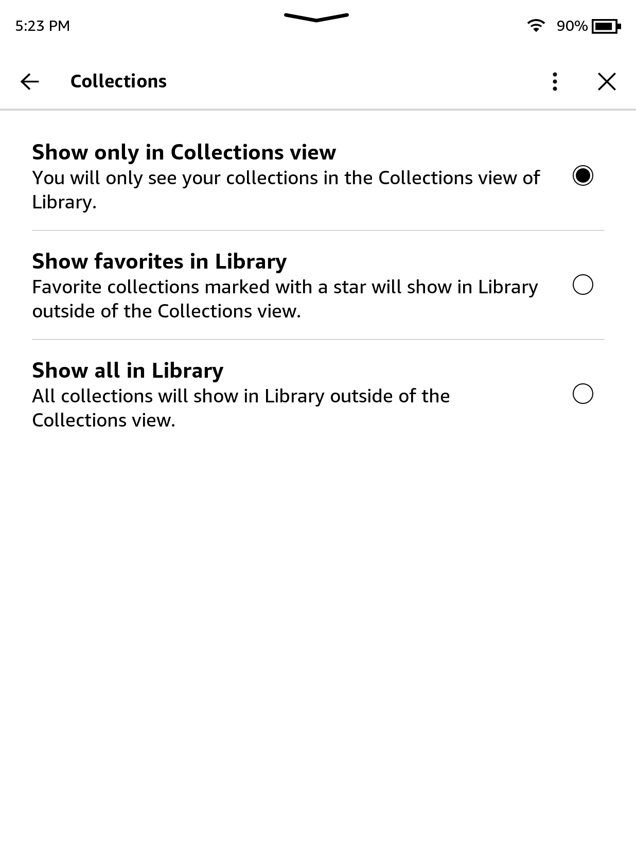
There’s now different ways to view collections on Kindles, and it can be rather confusing initially. With two separate menus to filter content, the new UI isn’t very intuitive, and there’s no explanation about how things are supposed to work now, so I can see why some people are having problems with it.
There’s now different ways to view collections on Kindles, and it can be rather confusing initially. With two separate menus to filter content, the new UI isn’t very intuitive, and there’s no explanation about how things are supposed to work now, so I can see why some people are having problems with it.
There are two different ways to sort collections, and the filtering option for collections doesn’t appear with the default option selected in settings (brilliant). If you want to view your collections in list view, try using a different viewing option in settings. One will show all your collections and all the books added to those collections in one long list, or you can select to just show collections that you’ve marked as favourites in the main list.
See
How Collections Work After Latest Kindle Update | The eBook Reader Blog#
technology #
kindle #
ereader #
collections 
Now that Amazon has started rolling out the new user interface to all Kindle ereaders dating back to the Kindle Paperwhite 3 that was released in 2015, there's some confusion about changes made to the collections feature. There's now different ways to view collections on Kindles and it can be rather confusing initially. With two